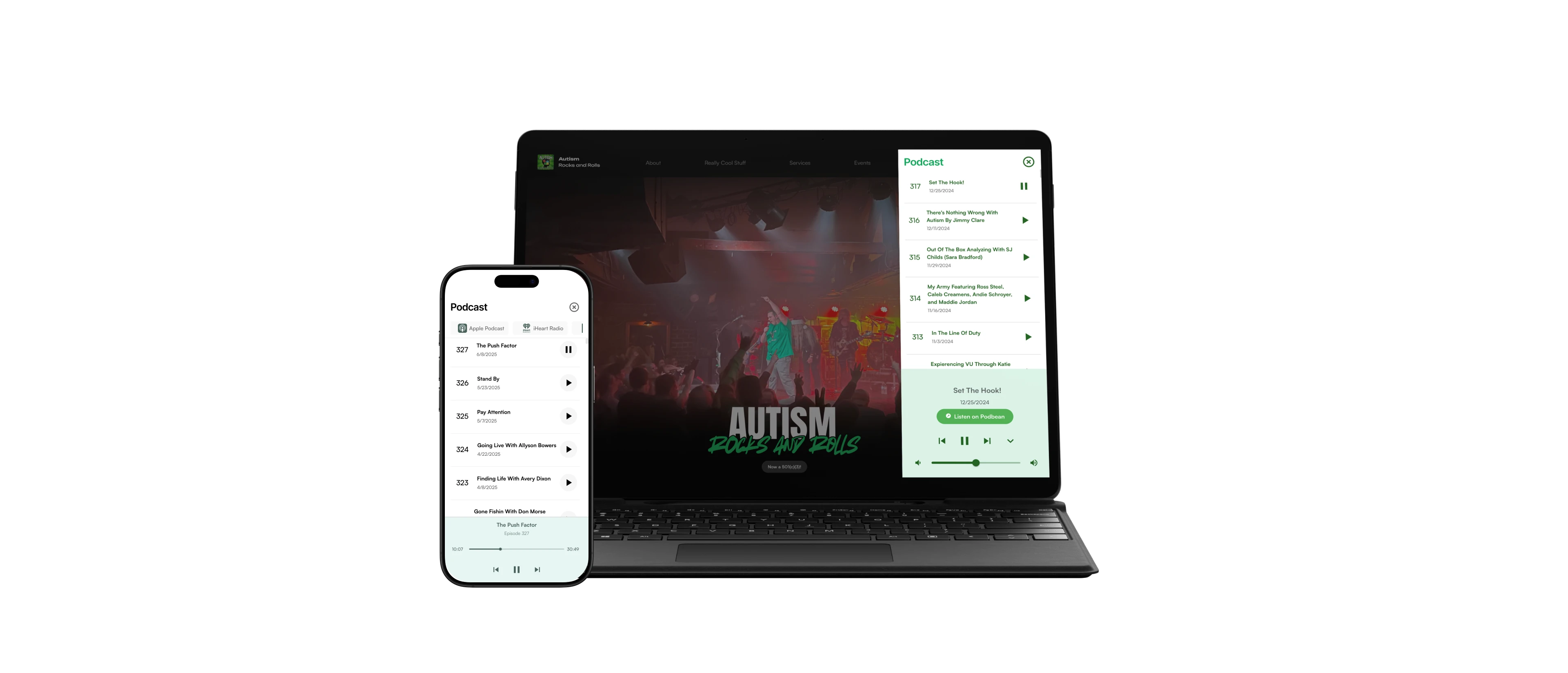
Autism Rocks and Rolls
Visit Website
2024
NGO
Website Redesign
Shipped
This website was created for Autism Rocks and Rolls as part of the IU Corps START Fall 2024 Project, I spearheaded a comprehensive website redesign. Through iterative wireframing and testing, I developed an accessible, multi-platform design system. Collaborating closely with co-founders, fundraisers, and the PMs, we launched a revamped site that attracted over 5k+ new users.
Team
Sriram Hemanth Kumar
User Experience Team Lead
Pranit Jena
Design & Research
Duration
1 Month
November 2024
Tools
Figma
FigJam
Tech Stack
Next.JS
React
Background
Sam Mitchell, CEO

Founded by Sam Mitchell, a 20-year-old entrepreneur and advocate, Autism Rocks and Rolls, Inc. is a nonprofit dedicated to raising awareness and empowering autistic individuals. Sam’s mission is to break the stigma around autism, celebrating that people are differently-abled, not disabled. His nonprofit offers public speaking, podcast coaching, podcast editing, sponsorships, ad space, merchandise, public speaking, educational supplements, guest appearances, and guest space on his podcast to spread this powerful message.
Problem
The platform faced accessibility, content management, and user experience challenges, making navigation difficult. Non-technical stakeholders struggled with content updates. The project aimed to redesign the website by enhancing accessibility, streamlining content management, upgrading user experience, and integrating Google Analytics for data-driven insights.
Key Objectives
Enhance accessibility to WCAG 2.0 standards
This upgrade improves navigation, readability, and usability for all users, including those with disabilities.
Increase user engagement
We introduced dynamic content and interactive features to enhance user engagement.
Intuitive information architecture
Clear pathways ensure users can find information quickly and effortlessly
Solution
We developed a responsible website with enhanced accessibility, a user-friendly content management system, and an improved user experience. The new design ensures seamless navigation, empowers non-technical stakeholders to manage content easily, and integrates Google Analytics for data-driven decision-making.
Design Process
Auditing Current Website
We conducted a comprehensive audit to assess the website’s accessibility, content management, user experience, and analytics integration. Insights from this evaluation guided improvements to align with project objectives and enhance overall usability.
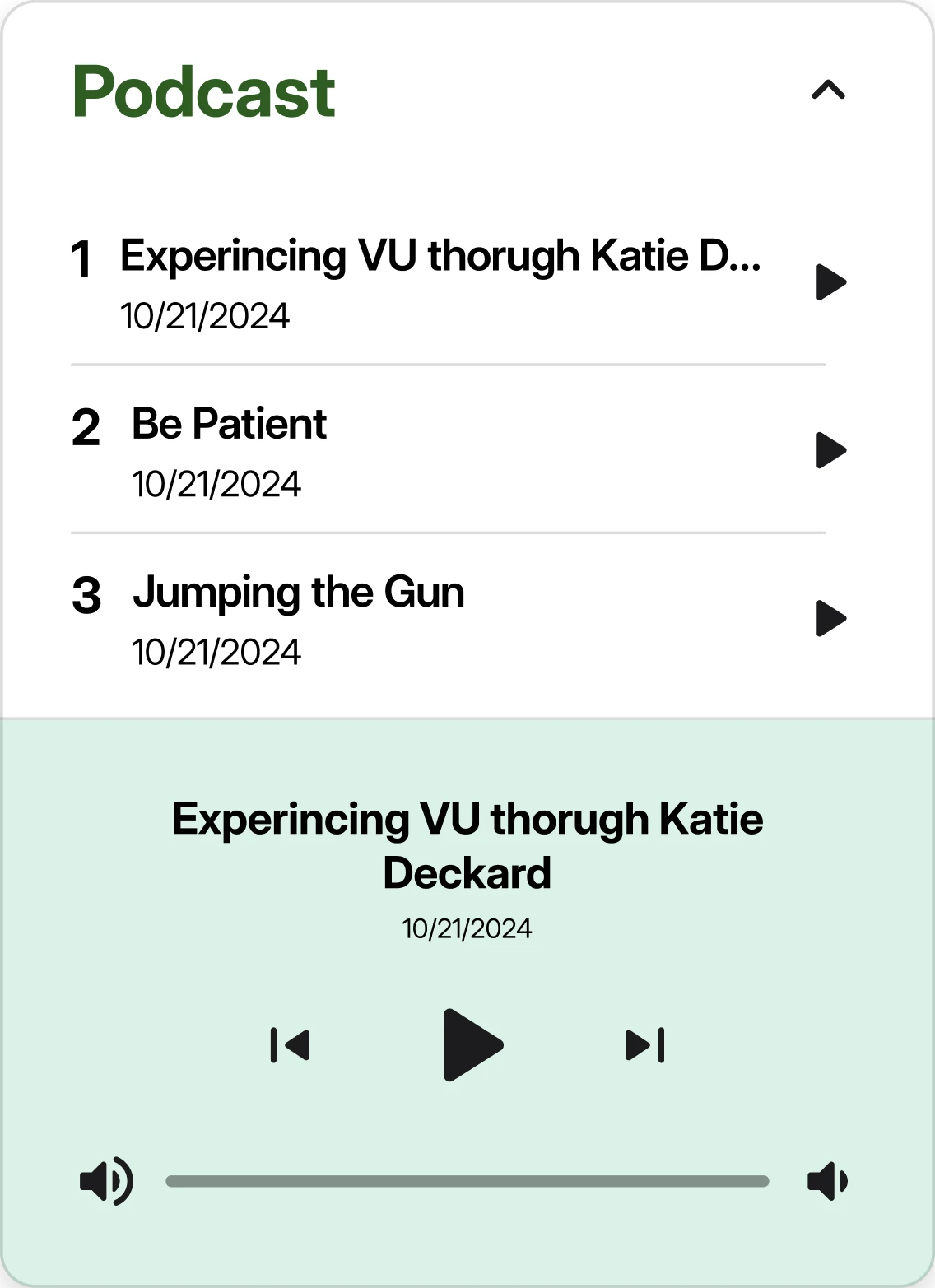
Podcast Player

Social Links

Podcast Listing
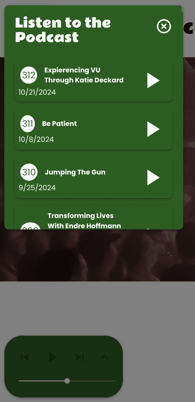
Mobile Navigation
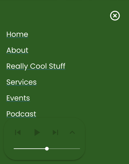
Navigation Bar

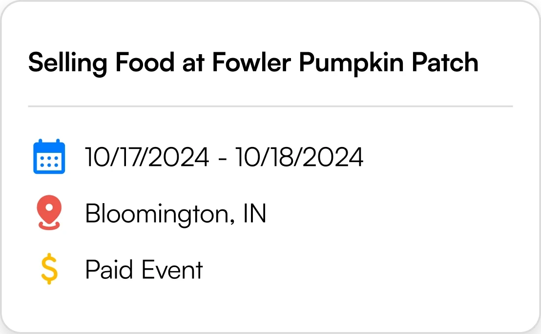
Events Card

Navigation Links

Navigation Buttons
Analyzing similar websites
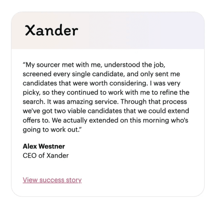
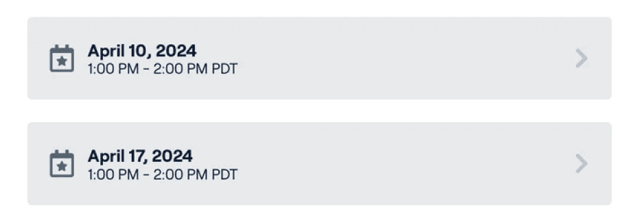
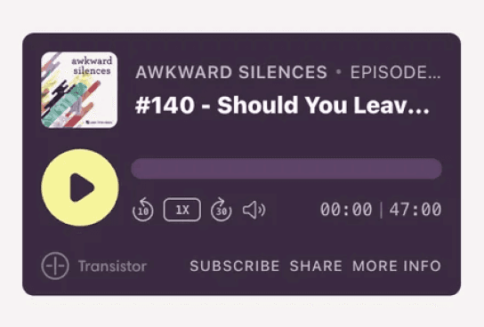
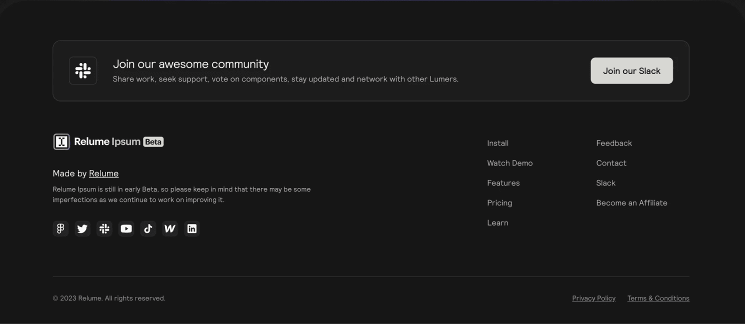
We analyzed several comparable services to identify best practices and innovative features that could be incorporated into our redesign.
Testimonial
Events

Schedule
Podcast Player
Footer
Navigation
User Testing
After conducting comprehensive user research and competitive analysis, we crafted a website design that aligned closely with user mindsets and motivations. Through iterative testing with 10+ participants, we gathered valuable feedback and refined the design accordingly. This user-centric approach significantly increased user satisfaction and overall experience.
Ideation
To understand the entire structure of our platform we conducted thorough research into the information architecture to understand what exactly we were dealing with.
Current Website Sitemap
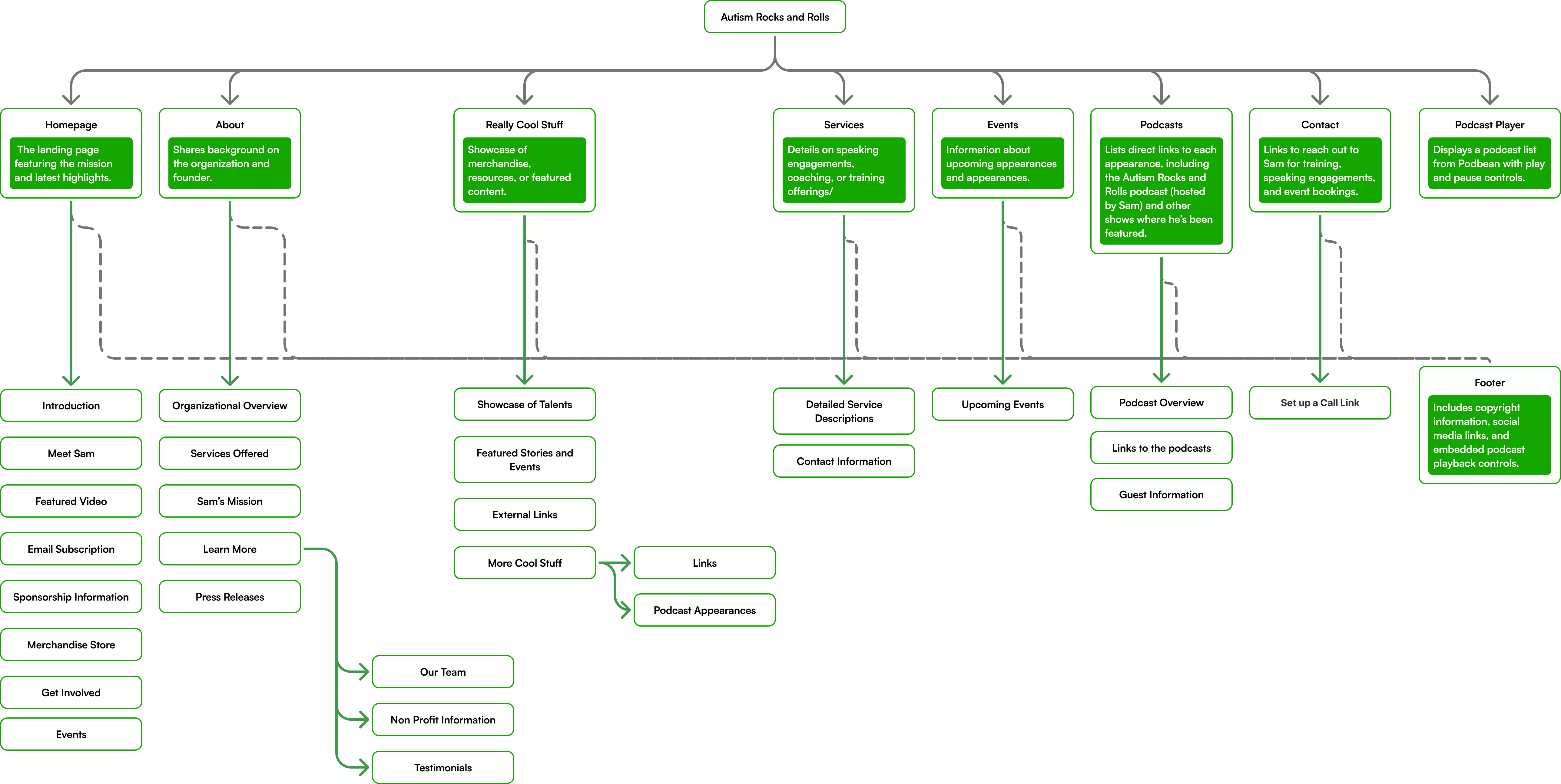
This gave us valuable insights on how we can improve content organization and hierarchy, navigation structure, and content gaps or redundancies to inform our design decisions and improve overall user experience.
Updated Website Sitemap
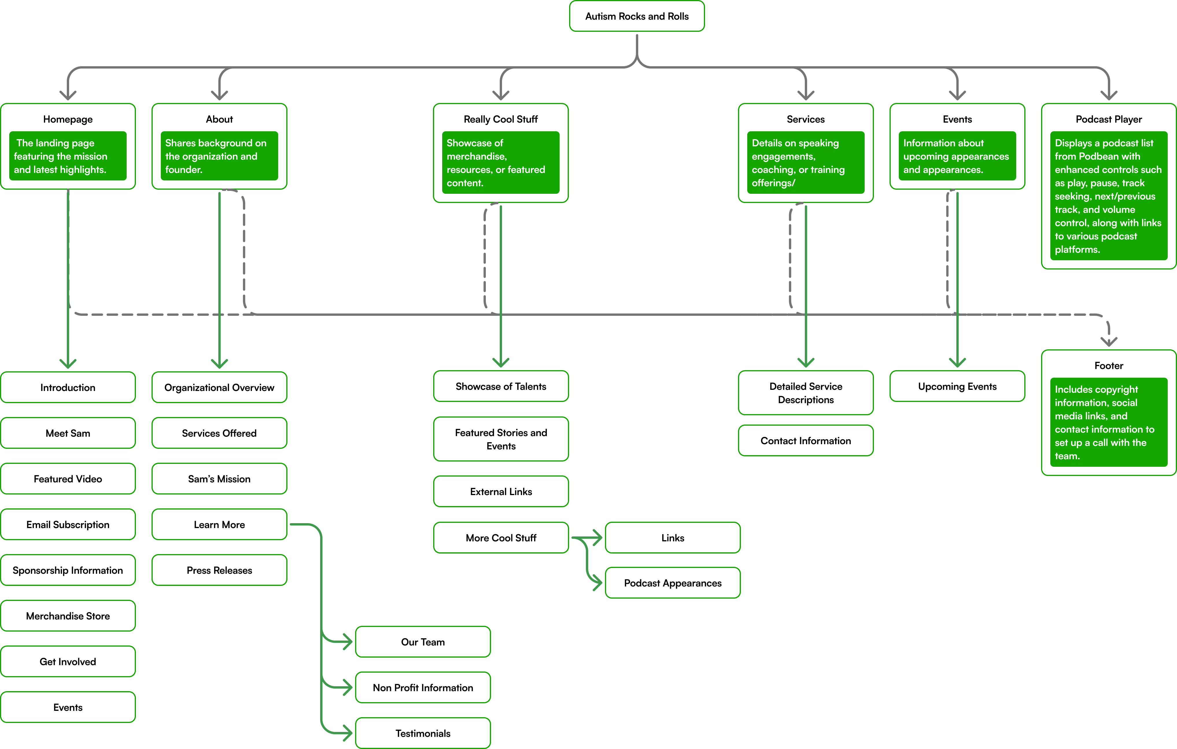
The updated sitemap integrates an enhanced media player directly within the Podcast section, replacing the previously floating, disconnected player to improve usability and increase page engagement.
The separate “Podcast” page, which previously contained links to external platforms, has been removed and its content consolidated within the new embedded player.
Additionally, contact information has been moved to the global footer to ensure visibility across all pages and streamline access for visitors.
Redesigning Components
Before
After

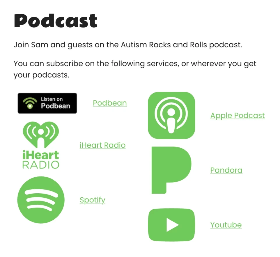
Optimized the placement of widgets to enhance user experiences and accessibility
Before
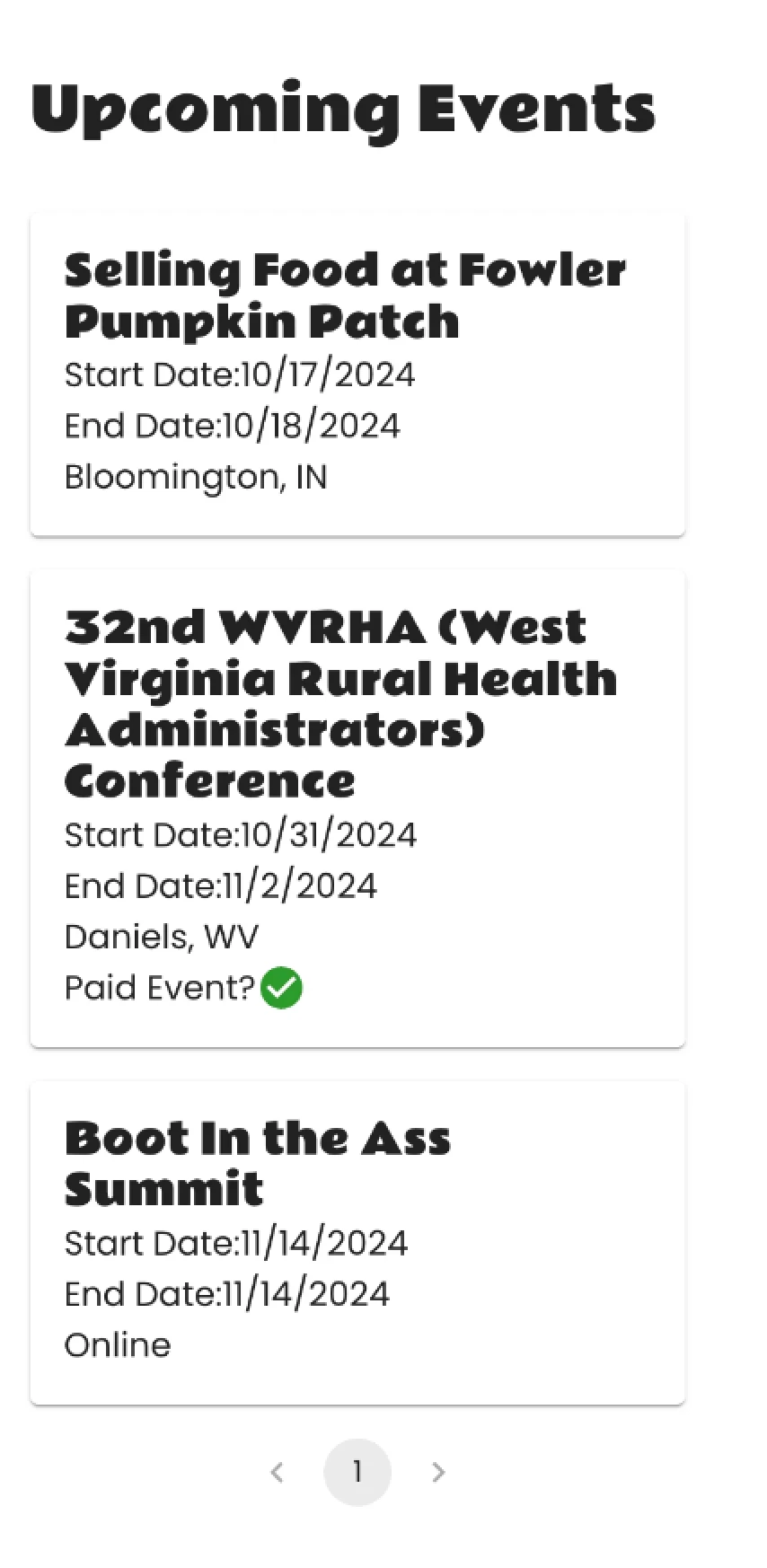
After
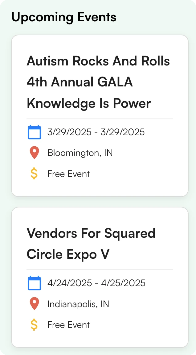
Intuitive icons, improved event visibility with location/price indicators, and organized service categories with consistent styling
Before
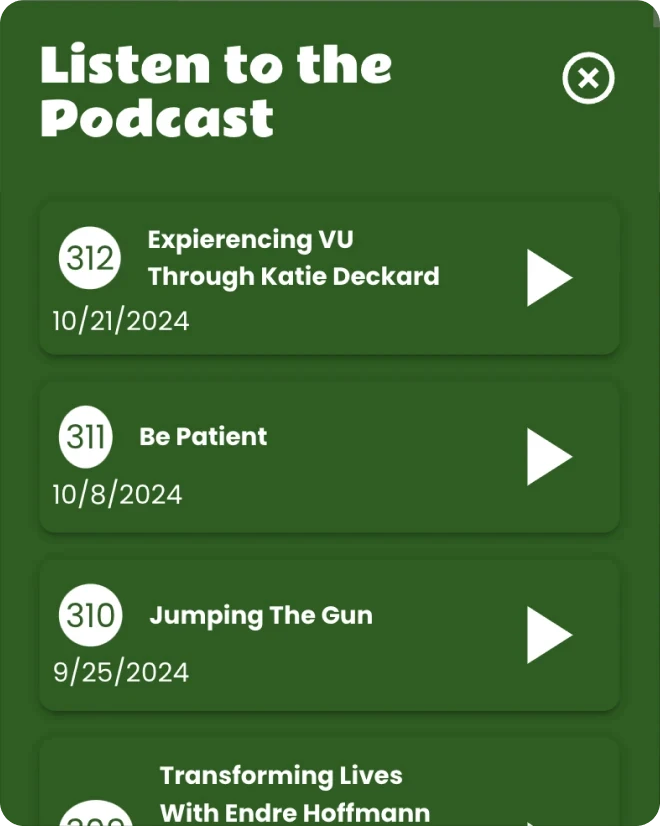
After
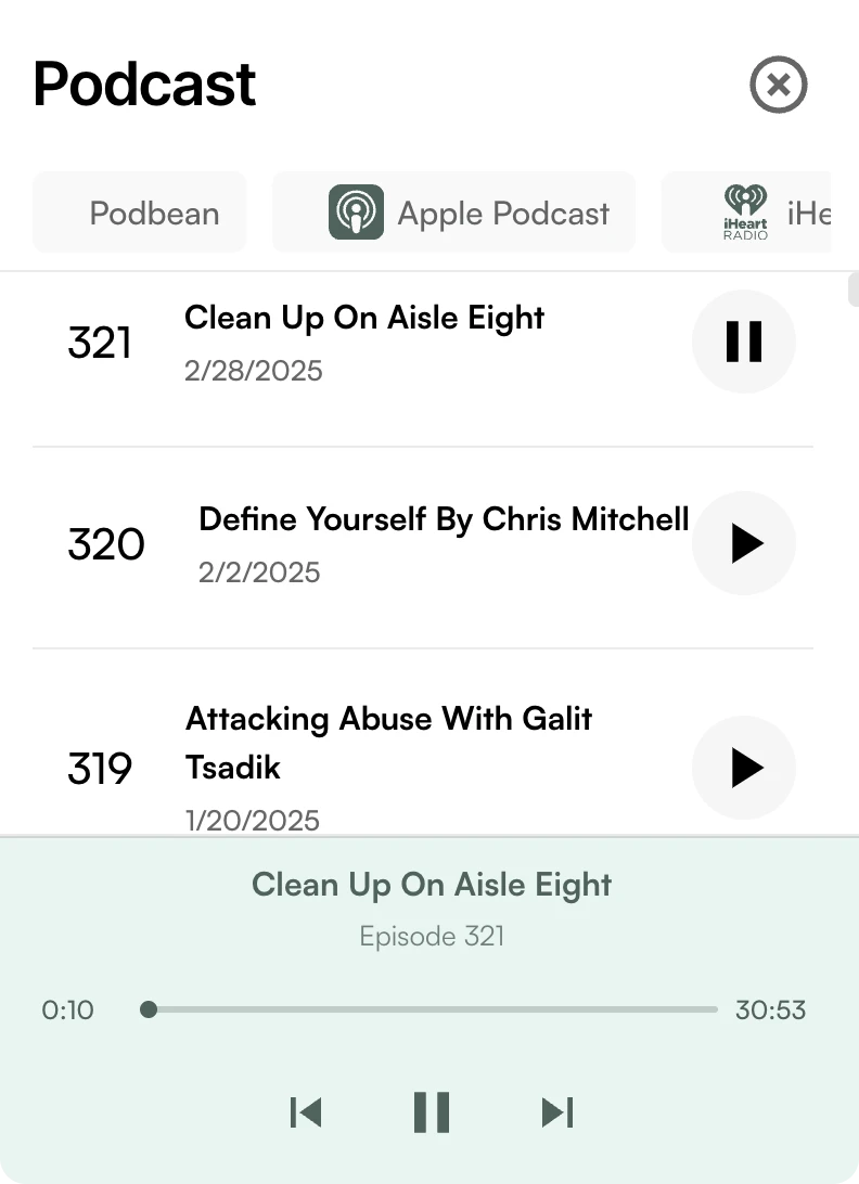
Implemented consistent brand colors and optimized widget layouts to enhance content visibility
Before
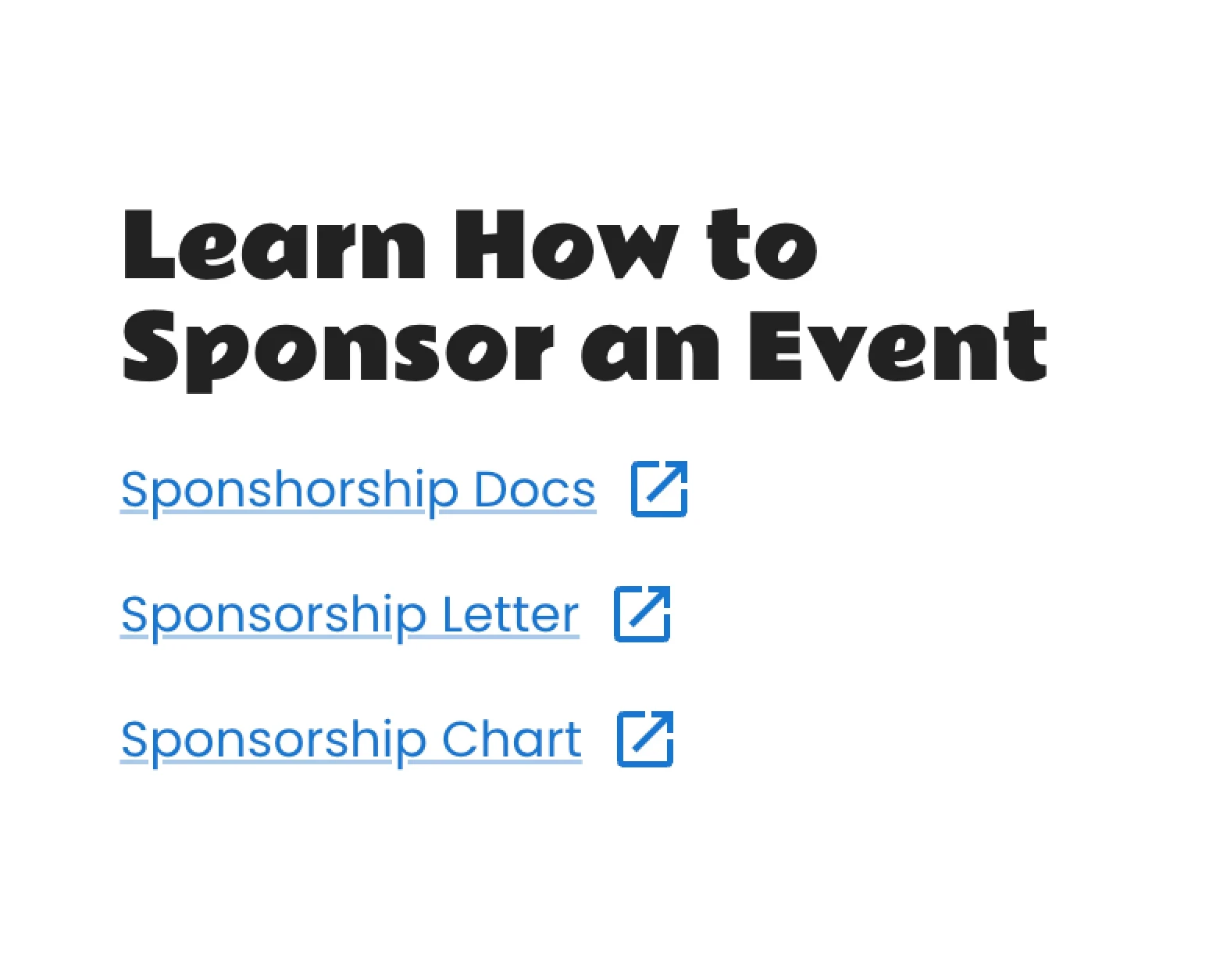
After

Before
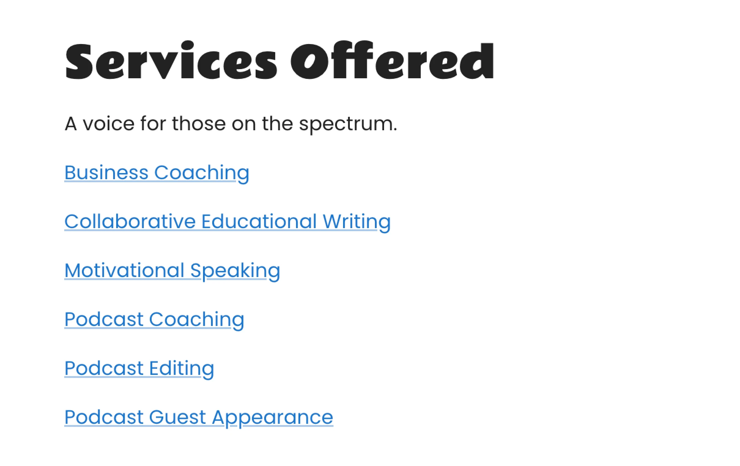
After
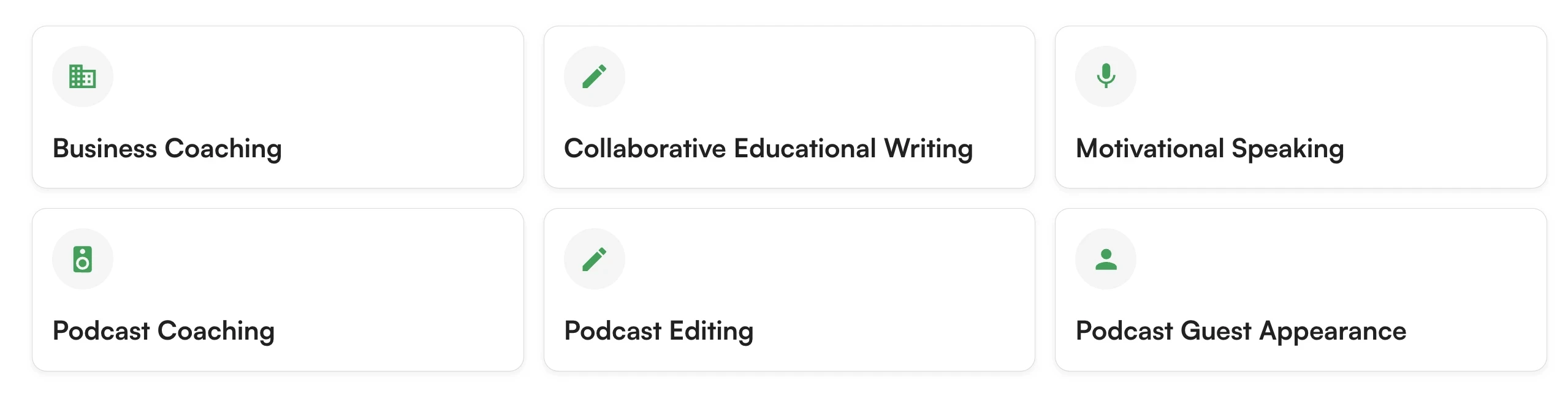
Consistent card-based layouts and replacing basic links with organized categories
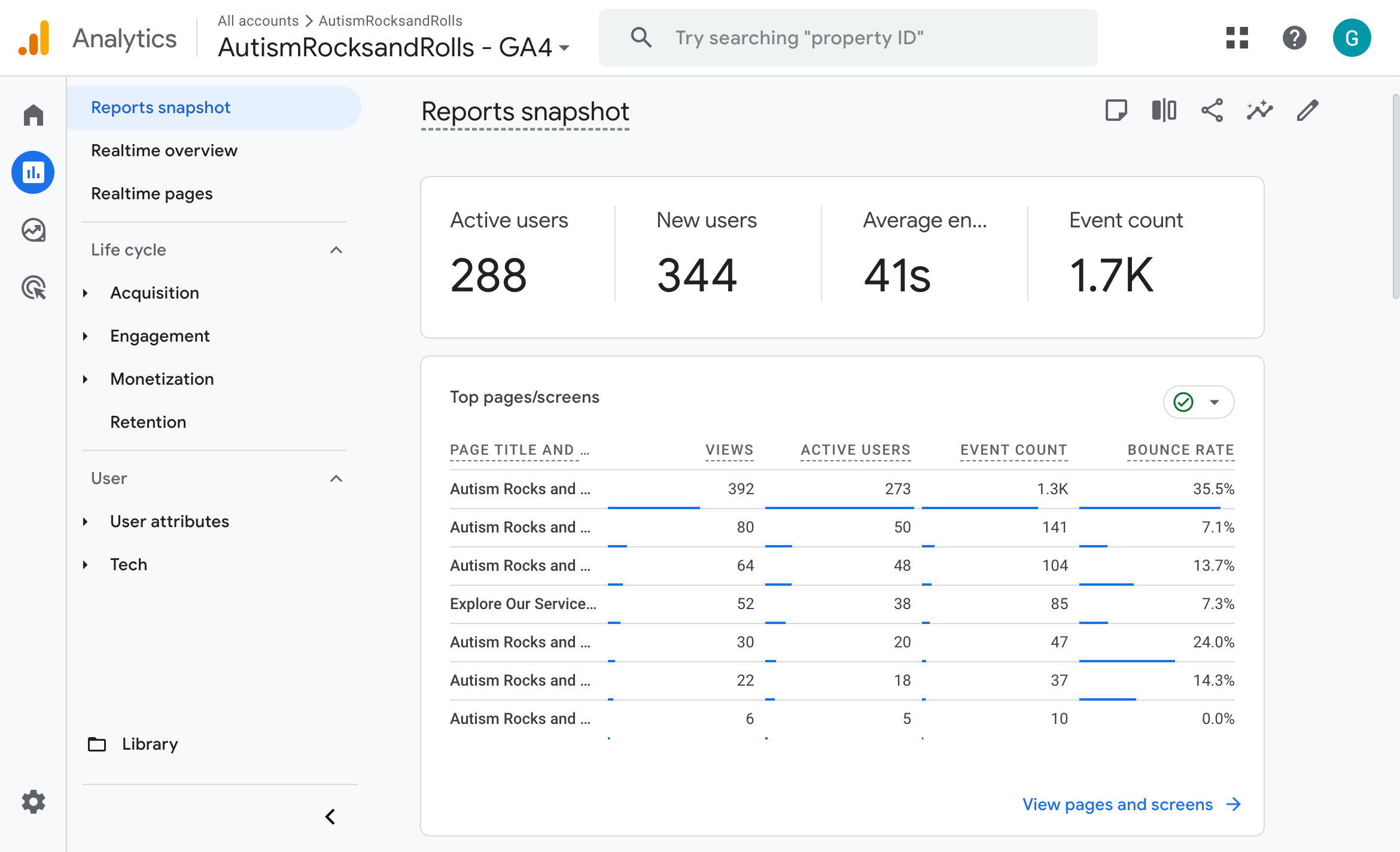
Google Analytics Integration
This enabled tracking user behavior, identifying navigation issues, measuring engagement metrics, and monitoring page performance. This data helped us make informed design decisions and validate improvements in user experience.
Analytics Report
Design System
Logo

Colors
Primary
100
#
74ffbe
200
#
2fff9e
300
#
00e87c
300
#
#00a357
400
#
005e32
10
#
00a357
Red
100
#
fb3748
200
#
d00416
10
#
fb3748
Yellow
100
#
ffdb43
200
#
dfb400
10
#
ffdb43
Green
100
#
84ebb4
200
#
1fc16b
10
#
1fc16b
Neutral
100
#
ffffff
200
#
e8e8e8
300
#
d2d2d2
400
#
bbbbbb
500
#
a4a4a4
600
#
8e8e8e
700
#
777777
800
#
606060
900
#
4a4a4a
1000
#
333333
10
#
333333
Typography
Satoshi Variable
AaBbCc
The quick brown fox jumps over the lazy dog.
0123456789
Inter Tight
AaBbCc
The quick brown fox jumps over the lazy dog.
0123456789
Spacing
#1
4#2
8#3
16#4
24#5
32#6
48#7
64Radius
#1
24Stroke
#0
1#1
2#2
4Components
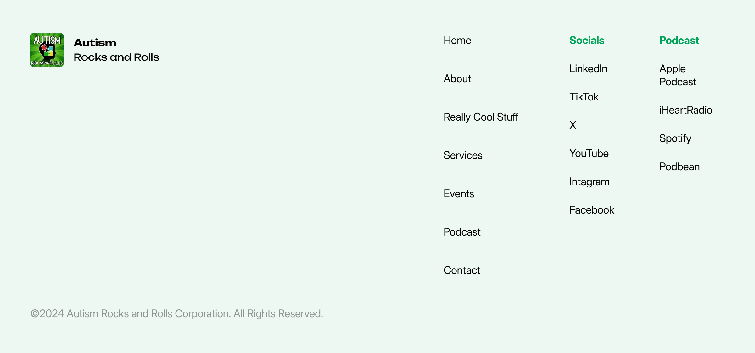
Footer
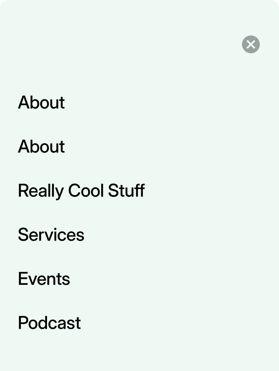
Mobile Nav
Testimonial Cards
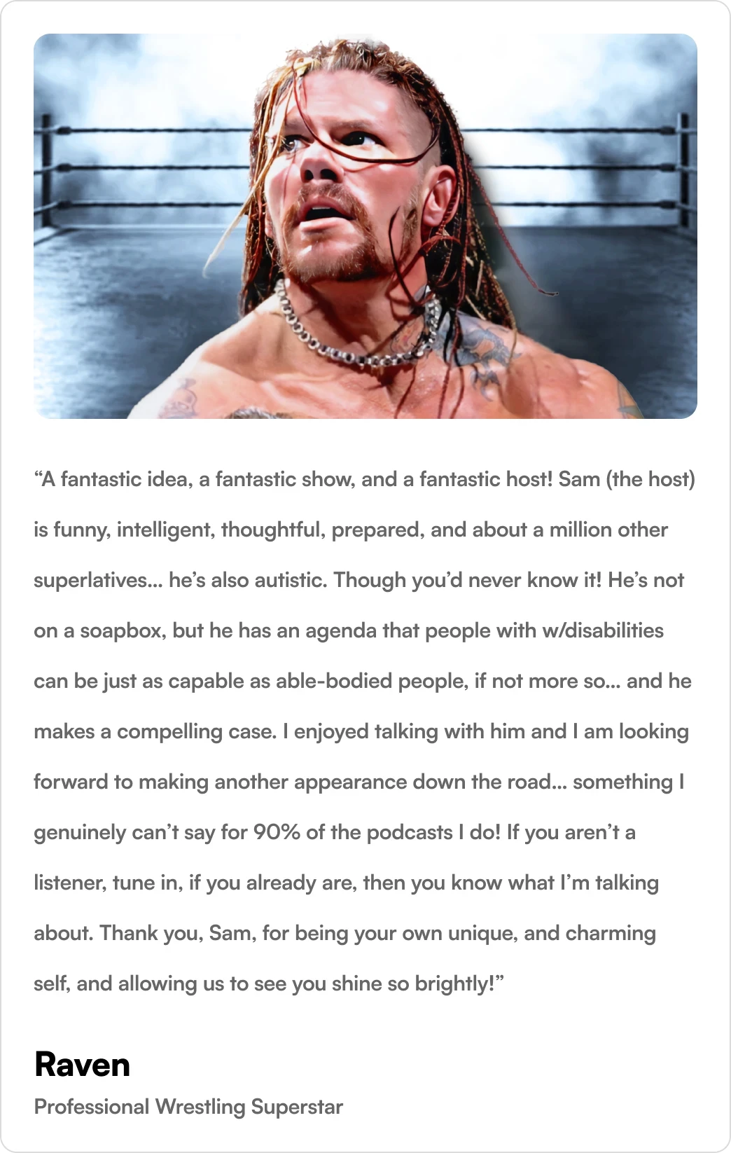
Highlighted Testimonial

Navigation Links
Podcast Player
Event Cards
Buttons

Reflections
Dealing with complexities & interdependencies
I learned how to prioritize workflows while managing the complexities of designing for multiple platforms. This experience helped me put forward and lead decisions effectively, navigating interdependent challenges and ensuring the team stayed on track. I also gained a deeper understanding of how to balance short-term goals with long-term scalability.
Testimonials
The sheer talent from these young gentlemen is outstanding. Their work ethic was off the charts.
 Gina MitchellCo-founder & CEO
•
Autism Rocks & Rolls1000% satisfied
 Steven JascewskyMember of the Board of Directors
•
Zoho Corporation